If Marvel wanted to let fans know straight-up that Loki would be a crappy made-for-tv production (and not to get our hopes up), they succeeded handily with the new logo. Fans immediately took to the internet to share their disappointment and offer upgraded logos for free, with a rallying cry that the character, made famous by Tom Hiddleston, deserves better. Crafting a logo may seem easy, but finding perfection in simplicity can be a daunting task. Design teams typically go through many iterations before stumbling on the right path, and some never even get there. Here are 10 other logos that, in the grand style of Loki, went straight into the worst-of pile.
Photo: Marvel Studios (Disney)
Super threads: The Mandatory 2019 Best Comic-Con Cosplay
You (didn’t) ask for it: 10 Absolutely Unnecessary Movie Reboots Coming Soon
Follow Mandatory on Facebook, Twitter, and Instagram.
Loki bad logos
-
'Jurassic Park'
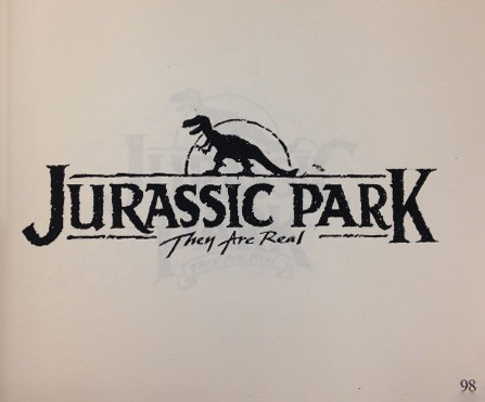
You may remember the iconic stamp from this 1993 blockbuster as the roaring skull of a T-Rex towering above a jungle canopy. And you'd be right. This is a failed version which producers had enough smarts to discard. Can't say the same for Loki.
Photo: Tom Martin (The Academy of Motion Picture Arts & Sciences)
-
'Star Wars'

After Star Wars was all but ready to release, George Lucas still didn't have a logo for the film. He may have gone with this version if not for a young design student by the name of Suzy Rice. Lucas gave her one direction: make it fascist. Rice dug up an old Nazi font called Helvetica Black and the rest is movie history.
Photo: LucasFilm
-
'Alexander and the Terrible, Horrible, No Good, Very Bad Day'
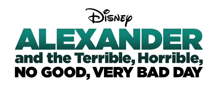
This is one of the laziest logos we've ever seen. It's almost as if the designer typed the title on his computer, stared at it for a long time, threw a color gradient on there, shrugged, and handed it in. To be fair, the movie title itself is pretty terrible, horrible, no good, and very bad. We can't decide which.
Photo: Disney
-
The 2012 Summer Olympics

Bad logos can be found everywhere outside of Hollywood. And this logo for the 2012 Summer Olympics in London takes the cake for most expensive, most visible, and most disastrous. Take a good look at what half a million dollars can get you. Citizens around the world boycotted the logo as soon as it went public, but the organizers stuck by their design, which looks like a bad game of Tetris as drawn by a drunk sailor on a stormy sea. Oh well, it was only seen by everyone in the world.
Photo: IOC
-
Institute For Oriental Studies

It really depends on how you look at it...or does it? This academic logo for the Institute For Oriental Studies in Russia may be a subconscious depiction of what Russian professors really think about all day. Or maybe it's just an innocent temple standing in the morning sun. Uh-huh.
Photo: Russian Academy of Sciences
-
Arlington Pediatric Center

We're not sure how many hands this logo had to pass through before being approved (and plastered all over the Arlington Pediatric Center), but the result was not a good look for this children's hospital in Virginia. After someone (everyone) noticed the logo looked a bit...questionable, the APC quickly replaced it with a less offensive, but equally crap nameplate.
Photo: Arlington Pediatric Center
-
Clinica Dental

Finally, a logo that's honest about dentistry. Just remember to bring a friend next time you have a root canal.
Photo: Clinica Dental
-
Toronto Raptors

Why does a Canadian basketball team have a dinosaur as their mascot? And why does this logo look like a cross between the Kool-Aid guy and a scrapped replacement for an Itchy and Scratchy sidekick? None of it makes any sense, except for the fact that after the team changed their logo, they started winning games. Go champs.
Photo: Toronto Raptors
-
UK Office of Government Commerce
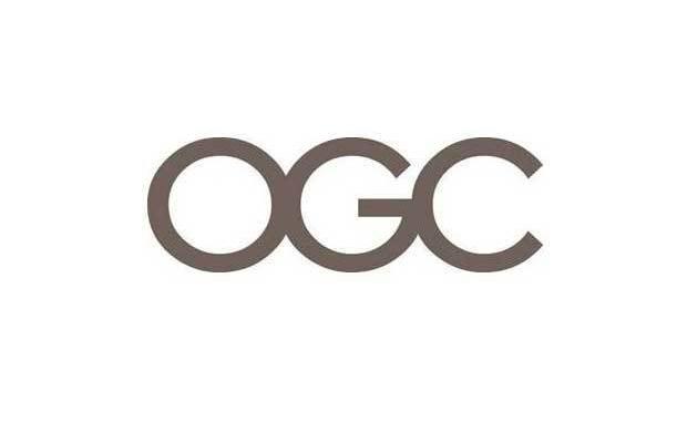
OK, at first glance this logo appears unspectacularly neutral. It's grey, has a boring font, and screams stuffy government waiting room. But when you tilt your head to the left, you start to wonder if this is actually a Banksy making fun of all the wankers in government.
Photo: UK Office of Government Commerce
-
Locum
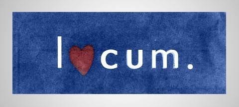
Who doesn't love Locum, Sweden's premiere paper company with the penchant for cutting-edge design? Is it just us, or can you imagine a Swedish version of The Office where a blond Steve Carell enthusiastically pushes this logo from the pages of Dwight's sketchbook to the packaging and letterhead of the entire company, before a cadre of angry stockholders come banging down the door? We're ordering the bumper sticker version right now.
Photo: Locum


